
Chai Kasarod Logo Design: A Creative Tea Brand Inspired by Kasaragod, Kerala
The Chai Kasarod logo is a creative branding concept that brings together the warmth of Indian chai, the identity of Kasaragod, and the familiar experience of travelling along Kerala's roads. Designed by Logoraj, the visual identity aims to transform a simple cup of tea into a memorable brand with a strong local story and the potential to connect with tea lovers throughout Kerala.The concept combines an abstract tea leaf, a tea jug or teapot, and a visual reference to the region's heritage. Together, these elements communicate refreshment, local pride, hospitality, and the everyday culture of stopping for a cup of chai.
The central idea is simple: a tea brand inspired by Kasaragod, designed to travel along every road and connect people through chai.
Logo concept and creative strategy
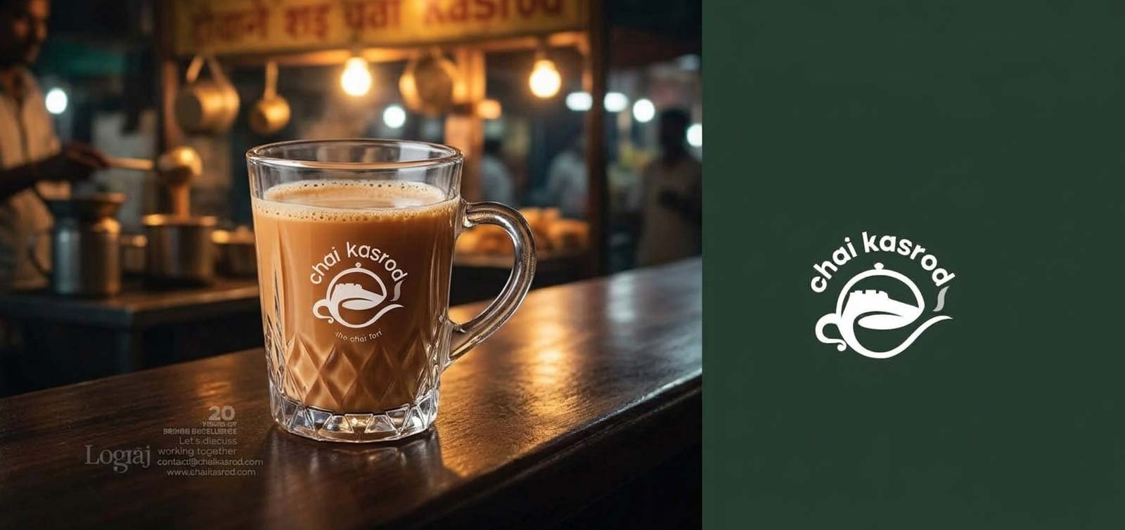

1. Abstract tea leaf — the heart of the brand
The tea leaf represents freshness, quality, nature, and the origin of the tea experience. Its curved, organic shape can form the central element of the logo, creating a distinctive symbol that works on takeaway cups, packaging, signboards, and digital platforms.

2. Bekal Fort — a connection to local heritage
Bekal Fort is a recognizable landmark of Kasaragod and a source of regional inspiration. The logo can incorporate a subtle fort-inspired curve, arch, or architectural silhouette into the tea leaf or steam, connecting the brand with the beauty and cultural identity of northern Kerala without making the logo overly complicated.

3. Tea jug and rising steam — the chai experience
The tea jug or teapot represents the familiar ritual of preparing and sharing chai. Flowing steam can merge with the abstract leaf to create a unified symbol, communicating warmth, freshness, and hospitality while keeping the design recognizable at small sizes.
Visual identity and branding direction
Deep tea green
Communicates tea, nature, quality, and a premium yet approachable chai experience. It also creates strong visibility on takeaway cups and packaging.
Warm tea beige and golden brown
Inspired by tea, warmth, and the earthy tones of Bekal Fort's laterite architecture. These colors can complement the primary green identity.
Distinctive typography
A clean, legible wordmark makes the name easy to recognize on storefronts, cups, menus, and social media. A carefully customized letterform can give Kasarod its own recognizable personality.
The overall design direction is to create a logo that feels local in its inspiration, contemporary in its execution, and flexible in its application.
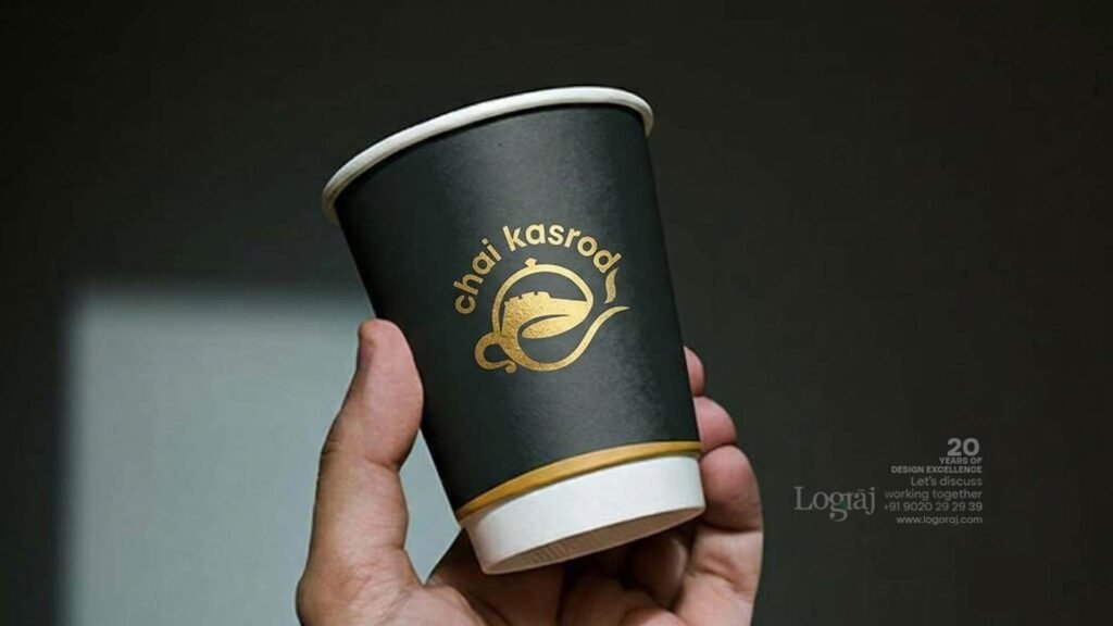
Branding applications and business potential
A strong logo needs to perform beyond a presentation image. The Chai Kasarod identity can be adapted for:
Takeaway tea cups and lids
Tea shop signage and storefront branding
Tea menus and price boards
Paper bags, napkins, and packaging
Uniforms and employee aprons
Instagram posts, reels, and promotional campaigns
Delivery platforms and online ordering
Future branches, kiosks, and franchise branding
- The road-inspired concept also offers an opportunity for future brand storytelling through ideas such as “Chai for Every Road” or “Your Roadside Chai Destination.” These are proposed marketing taglines, not existing verified brand claims.
Chai Kasarod Logo Design Case Study: A Creative Tea Brand Inspired by Kasaragod, Kerala
Chai Kasarod Logo Designed by Logoraj
Project Overview
The Chai Kasarod logo design is a creative branding concept inspired by Indian chai culture, the heritage of Kasaragod, Kerala, and the everyday journeys that connect people through tea. Designed by Logoraj, this tea brand identity explores how an abstract tea leaf, a tea jug, and road-inspired shapes can combine to create a distinctive and memorable visual identity.
The goal is to develop a recognizable tea shop logo that balances regional character with modern branding, making it suitable for takeaway cups, packaging, shop signage, menus, and digital marketing.
The Creative Concept Behind Chai Kasarod
Every memorable brand begins with a story. For Chai Kasarod, that story starts with the relationship between chai, Kasaragod, and the roads that connect Kerala's communities.The name Kasarod is explored as a creative brand expression inspired by Kasaragod and the idea of taking chai along every road. This interpretation transforms an everyday tea stop into a broader brand concept built around accessibility, familiarity, and local identity.The visual identity brings together three important elements: an abstract tea leaf representing freshness, a tea jug symbolizing the chai experience, and a road-inspired curve representing movement and expansion.
Abstract Tea Leaf Logo Design
The abstract tea leaf is a central element of the Chai Kasarod logo concept. Its organic shape represents freshness, quality, and the natural character of tea. By combining the leaf with flowing curves and the silhouette of a tea jug, the design aims to create a unified symbol that is recognizable, versatile, and easy to reproduce across different branding materials.This approach helps the brand communicate its product category without relying on unnecessary visual complexity.
Bekal Fort and Kasaragod Heritage Inspiration
Kasaragod is known for its cultural diversity, coastal beauty, and historic landmarks, including Bekal Fort. The region provides a meaningful source of inspiration for a brand that wants to express a strong local connection.The Bekal Fort reference can be translated into subtle architectural curves or shapes within the visual identity. Rather than reproducing the monument literally, the creative direction uses its heritage as inspiration for a more contemporary tea brand logo.This connection helps position Chai Kasarod as a brand rooted in a recognizable place while remaining suitable for a wider audience.
Color, Typography, and Visual Identity
The proposed visual direction uses deep tea green, warm beige, and earthy brown to communicate freshness, warmth, and a premium tea experience. Clean typography supports legibility, while a distinctive wordmark helps establish brand recognition.Together, these elements can create a consistent visual identity across takeaway cups, tea packaging, shop signage, menus, uniforms, and online platforms.
Why Strategic Logo Design Matters for a Tea Business
A professional tea shop logo does more than identify a business. It helps customers recognize the brand, understand its personality, and remember it after a purchase.
For a chai business, a clear and distinctive identity can support:
Brand recognition across different locations
Consistent packaging and storefront branding
Stronger visual communication on social media
A recognizable identity for takeaway and delivery
Future expansion into additional outlets or franchise formats
A carefully developed brand identity gives a tea business a consistent visual foundation as it grows.
What is the concept behind the Chai Kasarod logo?
The Chai Kasarod logo concept combines an abstract tea leaf, a tea jug, and road-inspired forms to express chai culture, regional identity, and the idea of connecting tea lovers across Kerala.
Who designed the Chai Kasarod logo?
The Chai Kasarod logo featured in this portfolio case study was designed by Logoraj Logo designer in Trivandrum as a creative tea-brand identity concept.
How does Bekal Fort inspire the Chai Kasarod brand identity?
Bekal Fort provides regional and architectural inspiration. Its distinctive curves and historic character can influence subtle shapes within the logo, helping connect the tea brand with Kasaragod's heritage.
Why use an abstract tea leaf in a tea shop logo?
An abstract tea leaf can communicate freshness and the tea category while providing a distinctive visual symbol that works across packaging, signage, takeaway cups, and digital platforms.
Why is branding important for a chai business?
Branding helps a chai business establish a recognizable identity, maintain consistency across customer touchpoints, communicate its personality, and create a foundation for future growth.
What makes a good tea shop logo?
A good tea shop logo is distinctive, readable, relevant to the business, and adaptable to different sizes and materials. A clear symbol, appropriate typography, and a consistent color palette help strengthen recognition.
What does the name Kasarod represent in this logo concept?
Kasarod is presented as a creative brand-name interpretation inspired by Kasaragod and the idea of roads connecting people through chai. It is a branding narrative rather than a verified historical etymology.
Final brand positioning
Chai Kasarod — A Taste of Kasaragod, A Journey Along Every Road.
This proposed tagline brings the brand's two strongest ideas together: its regional inspiration and its ambition to connect with tea lovers wherever the road leads.The most valuable part of this concept is the combination of a recognizable product symbol, a meaningful regional story, and a flexible branding system. That combination gives Logoraj a strong foundation for presenting Chai Kasarod as a thoughtful logo design and brand identity case study.
chai Kasarod logo design | Chai Kasarod logo | Kasarod tea brand logo | tea shop logo design | chai branding design | tea brand identity design | logo designer in Kerala | logo design in Kasaragod | Kasaragod branding design | Kerala tea shop logo | Kerala graphic design services | Indian chai brand identity | abstract tea leaf logo | teapot logo design | tea jug logo | heritage-inspired logo design | Bekal Fort inspired branding | road-inspired logo concept | minimalist tea logo | tea shop branding | chai cafe branding | food and beverage branding | beverage logo design | restaurant brand identity | takeaway cup branding | custom logo design for small businesses | professional logo design services.