
Project Overview & Strategy
Client: Beaver – The Master Builder (Construction & Architectural Development)
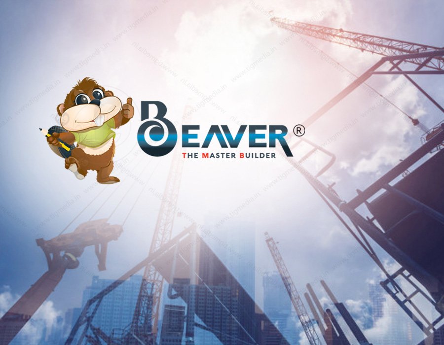
1. Project Overview & StrategyClient: Beaver – The Master Builder (Construction & Architectural Development)Industry: Commercial & Residential Building ConstructionCore Objective: Design an approachable yet highly professional visual identity that positions nature’s original architect—the beaver—as a symbol of structural strength, industrious engineering, and precision craftsmanship.Target Audience: Property developers, homeowners, commercial clients, and investors seeking reliable and meticulous construction services.2. Design Philosophy & Concept BreakdownThe Mascot: Friendly, Industrious & SkilledNature's Engineer: Beavers are famous for building complex, durable wooden dams and lodges. Incorporating an active beaver character reinforces natural craftsmanship, hardworking values, and reliability.Character Action: The mascot is depicted mid-stride with a thumbs-up gesture and holding architectural tools (pencil and blueprint/plans), giving the brand a welcoming, trustworthy, and expert persona.Custom Typography & Structural GeometryMonogram "Mr": The left element features a stylized "Mr" integrated with high-rise architectural silhouettes, symbolizing urban expansion, skylines, and structural growth.Stylized Lettering ("BEAVER"):The custom initial 'B' embeds a bold circular swirl, denoting planning and continuous structural flow.The letter 'A' is replaced with a stylized structural chevron/roofline icon ($\Lambda$), connecting directly to shelter, roofing, and structural framing.Tagline Typography: "THE MASTER BUILDER" is styled in bold red sans-serif caps to act as a grounded foundation beneath the primary logotype.3. Color Palette & Brand RationaleElementColorStrategic PurposePrimary MetallicDeep Blue & Silver Chrome GradientConveys corporate strength, structural steel, modern engineering, and trust.Accent RedVibrant Scarlet RedHighlights the tagline ("THE MASTER BUILDER"), signaling energy, passion, and high visibility.Mascot TonesWarm Earthy Brown & Lime GreenKeeps the character approachable, organic, and grounded in nature.4. Final Execution & VersatilityMulti-Element Composition: The design seamlessly merges character illustration, custom geometric typography, and architectural iconography into a unified brand lockup.Brand Applications: Optimized for construction site signage, hard hats, vehicle wraps, corporate invoices, blueprints, and digital marketing banners.

Brand Identity Case Study: Swiss Waffle n' More1. Project Overview & StrategyClient: Swiss Waffle n' More (Artisanal Bakery & Dessert Cafe)Industry: Desserts, Confectionery & Food ServiceCore Objective: Develop an inviting, premium, and emotionally resonant brand mark that highlights handcrafted waffles, rich chocolate pairings, and warm hospitality. Target Audience: Dessert lovers, youth, families, and casual diners seeking gourmet indulgence and cozy café experiences.2. Visual Mark & Symbol BreakdownThe Heart Motif: Emotion & Craftsmanship Heart Outline: Represents warmth, care, and passion for baking.Integrated Waffle Grid: The left side of the heart features a clean, geometric waffle pattern, establishing immediate product clarity.Dynamic Swirl: The right side forms a fluid, circular flourish symbolizing melting cream, drizzled chocolate, and artisanal preparation.Curved Tagline Arc: An arched header text, "Lovingly yours," sits directly above the emblem, reinforcing personal connection and handcrafted quality.Typography Hierarchy & Contrast"Swiss" (Script Font): Rendered in a fluid, elegant cursive to emphasize craftsmanship and European-inspired quality."waffle" (Modern Sans-Serif): Set in clean, rounded sans-serif to keep the brand readable, modern, and approachable."n' more" (Bold Sans-Serif): Highlighted at the base to signal a diverse menu beyond classic waffles (shakes, chocolates, and bakery treats).3. Color Palette & Strategic IntentElementColorStrategic PurposePrimary Brand ColorRich Magenta / Deep Purple GradientEvokes luxury, sweetness, premium chocolate notes, and a cozy dessert atmosphere.Supporting TonesWarm Cream & Chocolate BrownComplements the primary logo mark while referencing baked goods and rich toppings.4. Brand Versatility & ApplicationPackaging & Delivery: Works seamlessly on takeaway boxes, greaseproof waffle sleeves, beverage cups, and stickers.In-Store & Digital: Ideal for glowing neon storefront signs, menu boards, social media branding, and staff aprons.

Manager at Sipray
"Lorem ipsum dolor sit amet, consectetur adipiscing elit. Ut elit tellus, luctus nec ullamcorper mattis, pulvinar dapibus leo. Lorem ipsum dolor sit amet."

Product Lead at Virel
"Lorem ipsum dolor sit amet, consectetur adipiscing elit. Ut elit tellus, luctus nec ullamcorper mattis, pulvinar dapibus leo. Lorem ipsum dolor sit amet."